

Last week, the UK cover for A Blade so Black by L. L. McKinney was released on The Book Smugglers. It's a gorgeous, gorgeous cover. I love the nods to Alice in Wonderland in it; the rabbit with the clock top-left, the club and spade symbols on the left among the roses. Though, if I'm honest, I'm not crazy about the placement of the Entertainment Weekly quote, but that's a conversation for another day. Despite how beautiful this cover is, it did remind of something that UK publishers don't seem to do brilliant at - representing marginalised people on covers.


A Blade So Black is about a Black teen, written by a Black woman. The US cover for a Blade So Black features an actual Black woman. The UK cover does not. Yes, it's clear that the silhouette of Alice is a Black woman, which is important - you know, at least here, it's obvious through the illustration that this book has a Black main character - but why not have an actual, real life Black woman on the cover? It just seems really bizarre to me.
Representation matters, we know this. Seeing yourself matters. And it's a big difference between having an actual marginalised person on the cover than an illustration silhouette of a marginalised person. With the US cover, Black teens see someone who looks like them, but with the UK cover, they see an illustration of someone who looks like them. It is important to point out here that Black teens can still see themselves in the cover, even if it's not an actual Black woman, because there are other UK covers where marginalised people don't see themselves at all. But I would still vote for an actual Black woman over an illustration.
As I said, it's a gorgeous cover, but it's a thing that keeps happening with UK covers of YA books written by US authors, where the US cover features an actual marginalised person... and the UK publishers do a completely different cover without an actual marginalised person. As with these other examples...


God, I absolutely love the US cover for Two Boys Kissing by David Levithan. It's gone with a very literal cover of two actual, real life boys kissing! Two boys who are an actual couple! I love it! I remember thinking how bold and brave it was at the time, because it's just not something you saw on YA covers back then, and with people in the US banning books like they do, I just thought it was so brave, so awesome. I can't imagine how it must have felt, at the time, for gay teens to see two boys like them actually kissing on the cover when they walked into a bookshop. It's unapologetic and in your face - much like the two boys in the story, and much like the two boys, Matty Daley and Bobby Canciello, who broke the Guinness World Record for the longest kiss, the story is loosely based around. It must have been amazing!
And then we have the UK cover. Take the title away, and what are you looking at? Two floating heads made out of words. They're not even obviously male. They're not kissing. They don't even look like they're about to kiss. I get that the publisher was trying to tie it in with all the other Levithan covers they had - a different cover of the rainbow, all illustrations made of words - but in comparison to the US cover, it is so weak. Such a disappointment. There was an opportunity here to follow the US' lead, but it's like they weren't courageous enough.
In the case of A Blade So Black, both US and UK editions are coming out on the same day, but the US cover was released a few months before the UK cover, so perhaps the UK cover design was already well on it's way when the US was released, so maybe we can forgive that. But with Two Boys Kissing, the UK edition came out a year after the US edition. They would have seen the cover before they started designing their own. And sure, they had a formula for Levithan covers, but still. Would this cover have the same possible affect as the US cover? Would gay teens look at this cover and see themselves, like they would with the US cover? I really don't think so.


Now, I'm not quite as blown over with the US Cover of If I Was Your Girl by Meredith Russo. As a cover, there's nothing particularly special about it; it's a gorgeous photo of a beautiful woman, but as a cover, there's not a huge amount going on, in my opinion. As a cover, I don't think it's all that eye-catching. Until you realise that the model on the cover is a trans woman, just like Amanda, the main character, and the author, Meredith Russo, are trans women. Then this cover goes from being a meh cover to an incredible cover! Teenage trans women can look at this cover and see someone who is just like them. It's huge, it's powerful, and it's important.
And then you have the UK Cover. Where there isn't even a person, real of otherwise. A Venn diagram trying to illustrate the overlap of gender, that gender isn't a binary, that Amanda, as a trans woman, falls somewhere in the middle. Except she doesn't? Because she's a trans woman, she's not in the middle, she's at the female end? Unless it's not a Venn diagram at all, really, and is just meant to illustrate her transition? And if you're having to try and read into it, then maybe it's not quite as clear as they hoped, and that in itself is a problem. At least it's clear - but only if you look close enough - that this book is about gender in someway, because the 'o' in 'Your' is the gender symbols in one. But I don't think it's a great cover. I think it's more of a middle grade cover than a YA cover. And it doesn't have a trans woman on the cover, and the US cover does!
Again, this is an example where the UK publishers probably hadn't seen the US cover before they had already started working on their cover, because the two books came out a month apart, so again, maybe you could forgive it. But I am really not a fan of the UK cover.
However, sometimes, the UK tries to get it right...
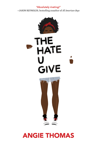

The US Cover for The Hate U Give by Angie Thomas features an illustration of a Black teen, where the UK cover features an actual Black woman. I think the US cover says more about the story, in that Starr is holding up a protest sign, where as the UK cover is just a floating Black woman's head, with the highlights in yellow for some strange reason. (Not really a fan of the yellow. Also, the one example of UK publishers putting a Black woman on the cover, and it doesn't show her actual skin colour. Suspect?) But it is an actual Black woman.


The US cover of Love, Hate & Other Filters by Samira Ahmed features an illustration of a South Asian woman. The UK cover has an actual South Asian woman on the cover. Though, in the US cover, at least we can see Maya's eyes, but we only get hair, forehead and part of an eyebrow in the UK cover, not even part of Maya's face. I do actually prefer the UK cover to the US, but I wish we saw her face. Couldn't she just be holding the camera?
I kind of generally think that it's a little lazy when UK publishers keep pretty much the same covers for books that the US came up with, but as I think the UK sometimes does a disservice to covers, when it comes to diverse books, maybe the UK should just stick with the US covers.


UK Covers:


The UK cover for When Dimple Met Rishi by Sandhya Menon is pretty much identical to the US cover, except a little has been cut from the top and bottom. Again, the UK cover of Sandhya Menon's second book, From Twinkle, With Love is pretty much identical to the US cover, just with a change of colour behind the title, as well as a fade at the bottom, and a colour change and larger font for author's name.


UK Covers:


And with the To All the Boys I've Loved Before trilogy by Jenny Han, the UK covers have cropped the photos of the US covers, changed or adjusted the colours of some of Lara Jean's clothes, and use the same font as the title for author name, and move the "from the author of" line.
But they still work when they keep the US covers and just change things a little. So I do think, when it doubt, use the US cover.
Over to you.What do you think about representation on covers? Models over illustrations, or vice versa? Models or illustrations over weird, not completely clear illustrations, or vice versa? Or edit the original US cover? And please let me know if you know of other UK covers where the representation isn't great when compared to the US.
If you enjoyed this post, feel free to follow me on:
Bloglovin' | Twitter | Goodreads


This was suchhh an interesting post Hun and I couldn't agree more - there needs to be more representation not just in books but on their covers too! Lovely post :)
ReplyDeleteGrace Louise || www.gracelouiseofficial.blogspot.co.uk/
You make some really good points here. I think a lot of people prefer books without people on the covers because it ruins their perceptions of the characters, so it can be a tricky business. BUT I agree that in cases of diversity, we really need to see more representation on the covers. I do sort of disagree about that first one, though, because I think that cover is stunning and I think you can definitely tell the ethnicity in the illustration. But that doesn't negate your point, in the least, and I can certainly understand it.
ReplyDeleteNicole @ Feed Your Fiction Addiction