

A Novel Cover Up is a semi-regular feature that looks at how covers are made. I have been fortunate enough to interview book jacket designer Tom Sanderson about how he designed the cover for One Seriously Messed-Up Weekend in the Otherwise Un-Messed-Up Life of Jack Samsonite by Tom Clempson, the second book in the Jack Samsonite series. Except for the final covers and the movie poster, all images in this post are copyrighted to Tom Sanderson and used with permission, and can be clicked to enlarge.
 Can you tell us about the cover for OSMUWeekend? What do you hope it tells readers about the story?
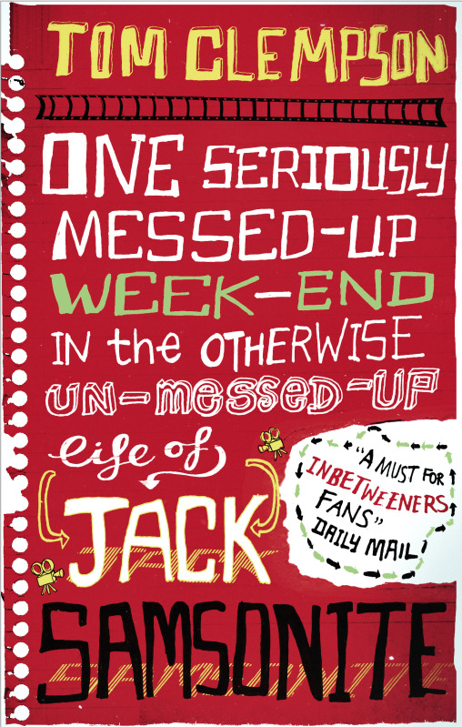
This is Tom Clempson’s second book about Jack Samsonite. I designed the first cover about 18 months ago for Atom. The new cover very much follows the style of the first book, it is meant to look quite doodley and graphic. As you can see the book has a very long title so the cover had to have a very typographic approach. The books have elements of Adrian Mole and The Inbetweeners, and the cover needed to reflect this and be contemporary and look cool, so a hand drawn approach was the right way to go with it.
How did you come up with the idea for the cover?
As I mentioned above it is the second book in the series, so it needed to follow the look of the first book but have its own identity. I originally did quite a bit of work on the first book. Parts of my research involved looking at the posters for Son of Rambow, which had just come out at the time. I loved the hand lettered, doodle feel of the titling and wanted to have a similar thing with this cover. I played with a few different ideas: I had the type look like it was hand lettered on a t-shirt, I drew a big doodle of a boy's head which was used as a holding device for the titling, and I played around with different bits of hand lettered type putting the emphasis on several parts of the title.


Son of Rambow movie poster, early drafts of Jack Samsonite Book 1, and final version of OSMUWeek.
In publishing you tend to go through a series of different approval stages with the cover design. The cover needs to work as an interesting image, as well as hitting the right look for the author, the sales teams, and obviously being right for the market. It took a while to get the design to work for everyone, but it therefore meant that once we had a cover that worked for book 1, book 2 was more of a straightforward approach – although there was a bit of finessing getting the “Inbetweeners” strapline to sit properly in the design.
What were you given to base your ideas on? Did you have a manuscript, or were you given an outline?
As a cover designer I am often commissioned to work on a book cover quite far in advance to it appearing on the shelves. Sometimes this can be nearly a year in before publication! This is usually because the various sales teams need a visual package to sell the book to their customers. Often this means that the book hasn’t been fully written. In that case the editor will give me a outline of the story and some key pointers to help me work out the cover. This was pretty much the case with Jack Samsonite 2.
What went into creating the OSMUWeekend cover? Can you tell us about the process? Who else was involved?
One of the things that I love about being a freelance book cover designer is that you work on many completely different briefs that require a different method of work. I’ll have several commissions on the go at the same time, crime fiction, a sci-fi novel or some young adult titles. On one job I might be putting together a photoshoot, or going out and taking photographs, another I will be doing something typographic work in Illustrator or getting lost in Photoshop. With this brief I got my paints and brushes out and started sketching and drawing straight on to paper, lots of fun! I then colourised everything on the mac and collaged the textured elements together.
What do you like most about this cover?
I like the fact that the whole thing is drawn by hand. It makes it stand out quite well.
Were there any other early ideas for the cover? Why didn’t they make it?
No, I pretty much nailed this one quite early on. Initially I was playing with making the cover look like it was a pile of manuscripts (Jack is in the film industry in this one) but that didn’t really work, so I just gave it a torn paper edge. As I mentioned before the main issue was making the strapline work and standout separately from the title.


Early drafts of OSMUWeekend.
Was it difficult to keep the covers similar, yet different enough to tell them apart?
I think the main issue with the second book was getting a strong colour approach that wasn’t blue! Red is punchy and was a natural choice.
Thank you, Tom, for such a great interview! Two book covers in one! It's awesome to see all the early drafts of both books. Such varied designs!
Tom Sanderson has been designing books for over 10 years. He began his website the-parish.com in 2009 and has worked for most of the major publishing houses for both the adult and young adult market. the-parish.com is a freelance design company specialising in design, illustration and art direction for the publishing industry.
Be sure to check out Tom’s website - he has designed so many covers, a lot you're sure to recognise - OSMUWeekend when it’s released on 7th March 2013!
Enjoyed this post? Then check out the previous A Novel Cover Up posts.


JO.
ReplyDeleteI can't even tell you how much I LOVE this feature.
PLEASE KEEP DOING IT FOR ALWAYS.
ANYWAY.
Seriously. I love seeing illustrated covers and graphics like this, LOVE the hand lettering, and LOVE THE INTERVIEW ♥
Haha, I do hope to continue! :) It just takes a while sometimes. But I do really enjoy it, and I'm so glad you love it! :D
DeleteThey are great early drafts, aren't they? So funky! :) The hand lettering is so cool!
LOVE this feature! Especially enjoyed seeing early drafts of the first Tom Clempson book cover.
ReplyDeleteSo glad you enjoy it! :) The very first drafts are awesome, aren't they? So cool! :)
Delete