

Over my years as a book blogger, there is something I have found: 9 times out of 10, the US edition of a book will have a better cover than the UK cover. I also think there's a kind of style about covers from each, that without being told beforehand, I'd be able to pick out which cover was for the US or the UK edition. This is not to say that the UK covers are awful, just that I feel more often than not, the US covers are so much better. Take these covers for example.
This Savage Song by V.E. Schwab


UK cover & US cover
The UK cover for This Savage Song isn't a bad cover, but it's nowhere near as eye-catching as the UK cover. It was only when writing this post that I realised the shape of the violin shows a street (click the cover to see it bigger). How cool is that? In comparison, the UK cover is just plain. Minimalistic covers can be really cool, but the US cover really wins out here.
What We Left Behind by Robin Talley


UK cover & US cover
Ok, neither of these covers are all that brilliant in my opinion. But the UK cover is just not my bag at all. It does give you an idea of the story with the joint male and female symbols, whereas the US cover doesn't tell you anything. I just think the UK cover is boring. I don't really like either cover, but the US cover is the one I prefer.
Under Rose Tainted Skies by Louise Gornall


UK cover & US cover
I actually really like he UK cover (though I prefer the lighter coloured pink - the UK covers come in three pink shades!), but just look at the US cover with the water coloured pink skies, especially against the white background! I love the birdcage on both, because Norah is trapped in her house by her agoraphobia, so that's a great symbol. I just love how pretty the US cover is!
The Smell of Other People's Houses by Bonnie-Sue Hitchcock


UK cover & US cover
Again, I actually quite like the UK cover, but look at that huge star-lit night sky! Oh, it's just so beautiful! That is a cover I want on my bookcase! It's just stunning.
If I Was Your Girl by Meredith Russo


UK cover & US cover
So the main reason I love the US cover is because it features a trans model on the cover. A book about a trans girl, by a trans author, with a trans model on the cover. That's just so awesome. The cover itself could have been better, but I'm still all for this cover. The UK cover is just a bit meh. I just don't really like it.
The Graces by Laure Eve


UK cover & US cover
LOOK AT THAT US COVER! And imagine it as a hardback! Oh my god, it's incredible! The UK cover isn't bad, I quite like it, but the US cover just gives this whole mysterious, occult-y vibe! Aaah, I love it!
The Art of Being Normal by Lisa Williamson


UK cover & US cover
Again, here's another case where one cover gives you an idea what the book is about, where the other doesn't, and the one that doesn't is more eye-catching. I suppose the rainbow road, with rainbows being a symbol of the LGBTQ* spectrum, but it doesn't particularly say "this is a trans book", where the UK cover does. And I do like the UK cover, again, but the US does draw the eye more.
Two Boys Kissing by David Levithan
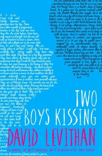
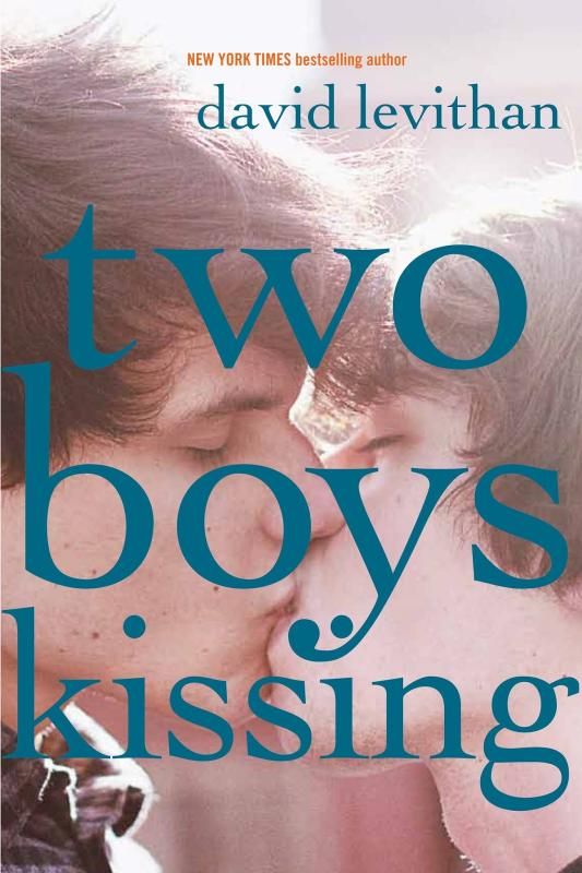
UK cover & US cover
The book is called Two Boys Kissing, and the US cover shows two boys kissing. Those wordy silhouettes on the UK cover aren't even touching, and they're not real people. I just think the US cover is so bold, and makes a statement, just the the two characters in the book do, just like the two boys the book was inspired by did. The US cover is always going to be better.
Although, occasionally, the UK do come up with a better cover than the US. Case in point:
The Girl From Everywhere by Heidi Heilig


UK cover & US cover
The US cover is pretty awesome, I love how we can see Nix in the water. And I do think the minimalist look works for this cover. But the UK is much more eye catching, in my opinion. I love how the flowers (orchids?) give that link to Hawaii, and all the maps... I just love it! It's such a gorgeous, gorgeous cover!
The Accident Season by Moïra Fowley-Doyle


UK cover & US cover
So, I'm cheating a little here as the US cover pictured is actually the cover for the paperback, whereas the hardback had a similar cover to the UK cover. But why change it?! The UK cover is absolutely beautiful! And it's so atmospheric and odd! The paperback US cover just doesn't tell you anything, really. And I think there are probably a lot of covers that are similar, a girl standing in outdoors, woodsy area - would it stand out among the others? Where the UK cover does stand out!
The Snow Child by Eowyn Ivey


UK cover & US cover
I love both covers here, but the UK cover of The Snow Child does catch my eye a little more. I can hear the silence that comes with snow and an almost enclosed space among the trees. Although it is an illustration, it feels more real, a glimpse in the dark. The US cover is an awesome literary cover, but it does feel very flat to me, very two-dimensional. The UK cover just gives the same feel as the book itself. I just love it.
Ash by Malinda Lo
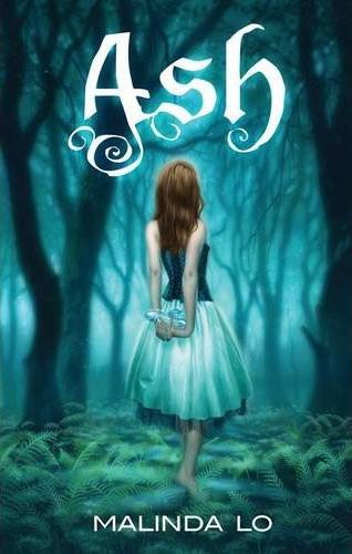

UK cover & US cover
Again, another two covers I love, but the UK cover of Ash is just so beautiful, and draws the eye a whole lot more than the US cover. We do see a lot of covers with models on these days, and unless they do something a little different, I think the illustrated covers are going to draw the eye more. The UK cover is a work of art, in my opinion.
I'd like to point out that I'm not criticising the cover designers here. The publishers give the designers an idea of what they would like and several drafts and worked through depending on what the publishers want. And, as I've said, I've liked both covers for most of the examples shown. But I do think the US generally has a edge over the UK when it comes to cover design.
What do you think? Do you disagree with me with any of these covers, and prefer the other? Are there any other books where you think the US - or the UK - has a better cover in comparison? Let me know!


I agree...US generally wins.😂 I mean, I feel bad for saying it because Australia always gets the UK covers too so I should probably be loyal to my country. BUT THE US COVERS ARE JUST GORGEOUS AHHHH. Although I agree that The Accident Season is 10000% better for the UK so at least they got that one right.😂
ReplyDeleteRIGHT?! The US covers are, generally speaking, pretty amazing! I love them, and we don't get to have them most of the time :( It makes me sad!
DeleteAnd yessss, I love the UK cover for The Accident Season! It's so odd, but it's really beautiful, too! I love it!
I think it depends on what you like. While I agree the US does get the most awesome covers - occasionally some UK covers surprise me and I think "Yeh, we got the better one :)" I had that feeling when I saw the covers for Maria V Snyders Study series :)
ReplyDeleteI haven't seen the US covers for the Study series, I have to say. But yeah, we do occasionally get it right! It's just a shame the US always seem to out-do even our not-awful covers!
DeleteThanks for stopping by!
OMG this is so on point! I also think that US covers are generally prettier than the UK. Bummer because in Indonesia we usually get the UK covers :') I really love the US version of The Graces and The Smell of Other People Houses! <3
ReplyDeletePuput Sparkling Letters
Thank you! I do think it's a little sad when a country gets another country's covers... though I think we'd all be better off getting the US covers! God, The Graces' and The Smell of Other People's Houses' covers are just gorgeous! I do love them! :)
DeleteThanks for stopping by!
I agree with almost all of your choices here. I think I actually prefer the UK cover for The Art of Being Normal and MAYBE even The Smell of Other People's Houses (though I do agree with you about that night sky and I might love it even more in person). I actually think I like the US cover of The Girl from Everywhere, but I TOTALLY agree with you about the paperback of The Accident Season. That cover has absolutely nothing going for it. And the UK Ash IS stunning!
ReplyDeleteNicole @ Feed Your Fiction Addiction
It's great to hear your thoughts on these covers! I do love that night sky, it's just gorgeous! I do love it! :)
DeleteThanks for stopping by!