
Ahhhhh!!! Firstly, thank you so much to the amazing Jo here at Once Upon a Bookcase for letting me guest-post here today! I hope you enjoy it! I decided to post about book covers , one of my favourite things in the world, (first comes the actual books!) and will be talking about 3 different categories. I hope you enjoy my guest-post..... :-)
PRETTY COVERS
I love pretty covers! Here are some of my favourites, what do you think of them?....
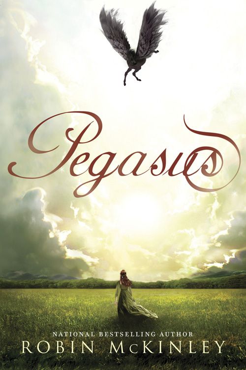
I LOVE this cover! Apart from not actually reading the book....(lol!) everything is amazing! And I do really want to read this....
Likes-
.The way the title is written (all nice and curly and wurly and colourful and......etc, etc!..)
.The girl and pegasus, I love the way one's below the title and one's at the top.
.You can see the authors name clearly.
Dislikes-
.I don't know if this is just me being dumb (yer, probably!) but even though I love how the title looks, it is quite hard to read at first glance, which usually (the cover and the title) draws me to a book.
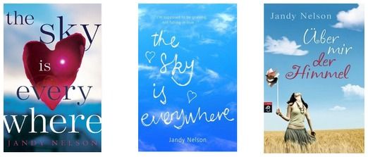
Honestly, I love all of the covers of The Sky is Everywhere! The last cover (from the right) is the German version. My favourite is probably the 2nd one, which is the UK cover....
First Cover (US)
Likes-
.The heart-shaped petal in the background, it is really unique and pretty :-)
.The font and layout of the title, it is big and fills up the whole cover, but I like it like that and it really makes the book stand out.
.The background- the background has been zoomed out on and so you can't see it that well on purpose, but I like it like that as it highlights the brilliant name of the book and the heart-shaped petal which I love.
Dislikes-
.You can't really see the authors name very well, because of the pale colour.
.Even though, again, its probabky me just being dumb but a bit of the petal is covering the word “Sky” and so you can't see it very well.
Second Cover (UK)
Likes-
.I LOVE the title font! It is made from clouds and really unique and eye catching.
.I also really like the little hearts inbetween the title :-)
.You can see both the title and author's name really clearly.
Dislikes-
.I think the cover, at first glance, looks quite plain as there is so much empty space.
Third Cover (German)
Likes-
.Even though the title is in German, I really like the font in which it is written!
.I like way the girl is looking up into the sky, and having a model on this cover makes it unique to the other two.
Dislikes-
.On the side of the book there is a little black and red logo (which I think is the publishers') and I kept on thinking it was in the actual cover design!
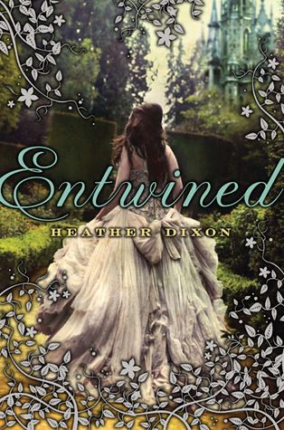
This is SUCH a pretty cover! I love everything about it! I especially love the models amazing dress!
Likes-
.I love the silver leaf and flower patterns on the edges.
.I absoloutly LOVE (x100!) the dress.
.I really like the castle background.
Dislikes-
.I don't really like the font of the author's name, but honestly, I like basically everything about this cover!
I don't really know if I like books with models on, it depends what the models look like on the cover. Here are a few of my favourites, again, what do you think?......
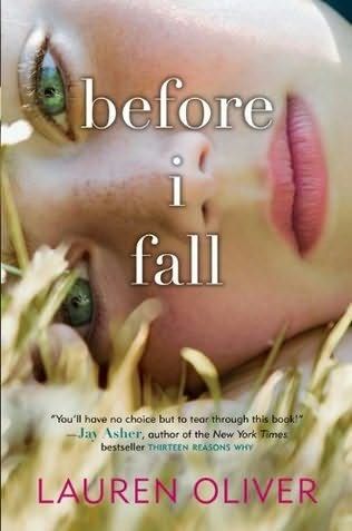
I really like this cover! The fonts, the model, the background, I love it!
Likes-
.I really like the model. It's really creepy!
.I also really like the fonts and layout of the title and author's name. They're really clear to read but still look interesting.
Dislikes-
.I don't really have any dislikes about this cover! :-)
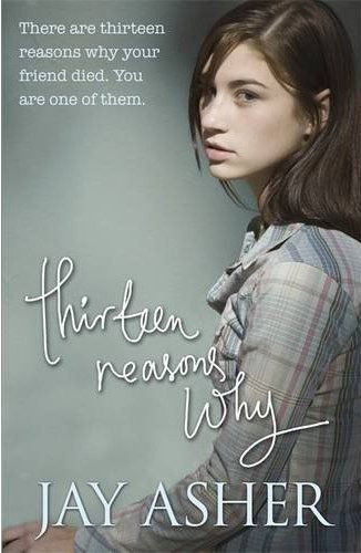
Likes-
.I really like the font of the title.
.I quite like the cover model. The way she is looking suites the story line well.
.I like the font of the sentence at the top, “There are 13 reaons why your friend died. You are one of them”
Dislikes-
.I don't really like the font of the author's name and I think it's to big for the cover.
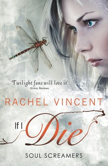
Likes-
.I really love the way the title's written! There are loads of different fonts and I especially love the way the word Die is written.....!
.I also really like the model! I really like the colours of her hair and her facial expression really suites the storyline.
.My favourite thing about this cover is probably the striking colours! The orange and silver/grey really go well together and look really nice!
Dislikes-
.I think at first glance it can look a bit like a movie cover, but I still really like it. :-)
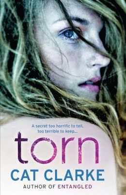
I think this cover is really creepy! But I love it and it's one of the most eye-catching covers I've ever seen.
Likes-
.I think the model goes really well with the story and is exactly how I'd imagine Alice, the main character.
.I also really love the way the title is written.
Dislikes-
.I don't really like how the author's name is written, I think it should be slightly smaller.
It depends what series, I do really like “series covers”- where a series of books have a similar themed cover, but sometimes some can be quite boring. Here are my favourites!....
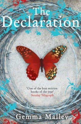
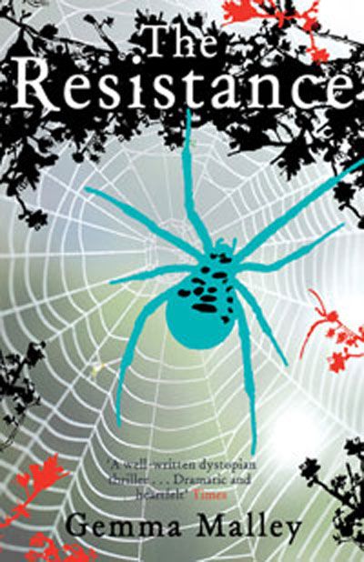
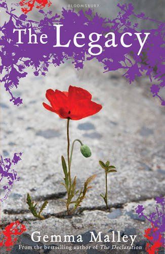
Here is the Declaration series by Gemma Malley! I LOVE the covers and they're some of my all time favourites. :-)
Likes-
.I like the way in each cover, there is one thing in the middle that catches your attention. In the first book, a butterfly, in the second, a spider and in the third, a poppy.
.I love how each title is written, you can see it clearly and even though you can't see it in the picture, it feels kinda 3D.
Dislikes-
.On the second cover (the Resistance) I think the author's name should be in white not black. I think you will be able to see it clearer and the other 2 covers are both in written in white as well.
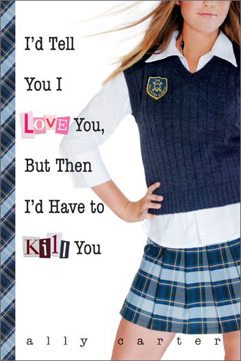
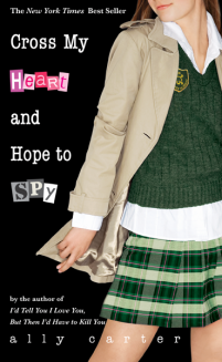
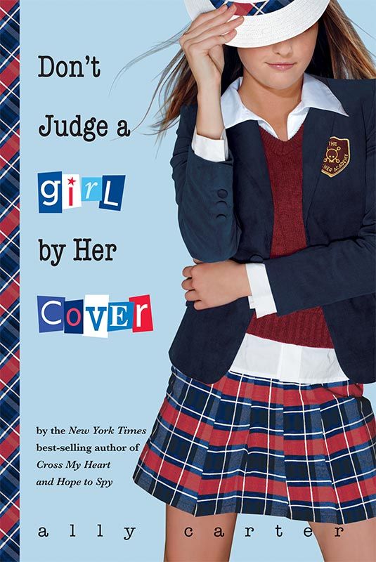
These are the first 3 books in Ally Carter's Gallagher Girls series. (There are four books in the series, soon to be five!) These are the old covers, but I still really love them!...
Likes-
.I like the way some of the words are in a different font to the rest of the title (I.e: In book one the words are “Love” and “Kill”)
.I like how the author's name is written.
.The models' poses and outfits really suite the storyline and main character.
Dislikes-
.On the second book, the author's name isn't as clear as the others.

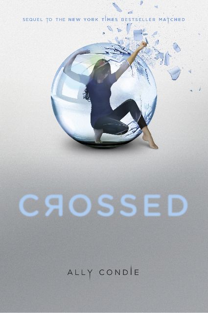
I LOVE LOVE LOVE these covers!! These are the 2 books in the Matched series by Ally Condie, and a third one is yet to be released and when it is, I can't wait to see the cover!
Likes-
.I absolutely love the way in the first cover, she's stuck in the bubble, and in the second one, she's breaking out. I think maybe in the third one it might be her standing outside the bubble?....(what do you think?)
.I love the unique font of the title and author's name.
.In the first cover, I love the pink and the green.
Dislikes-
.I think on the second cover, there could have been a phrase inbetween the bubble and the title like on the first cover.
I thought for the last bit of my guest-post, I thought I would do a “Series covers” Which Cover....
First versions
Second versions
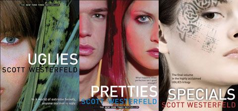
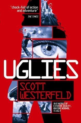
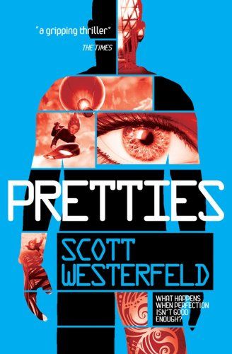
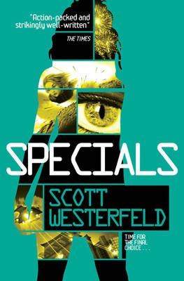
Which versions of Scott Westerfeld's Uglies series do you prefer? The first, or the second?......
I saw the first book in the Uglies seires (Uglies) and the cover was the first version. It immediatly caught my eye and I love how it's shaped like a person, made from pictures and words. The second version covers aren't my favourite. I think they look quite old fashioned but then again, I think the first and third ones (of the second version) aren't so bad.
Which versions do you prefer?.....
Thanks so much again Jo for letting me guest post! I love this blog so much! :-)
Beth
Page-turner
Thank you, Beth, for beautiful cover filled post! Be sure to check out Beth's blog, Page-turner, and her enthusiastic reviews!
What do you think of the covers Beth has discussed?


0 comments:
Post a Comment